Big bold colors, exaggerated character designs, visualised personalities and densely packed information typify a lot of Japanese graphic design, and it’s these techniques that can be used as a wealth of inspiration.
So, we’ve plunged into the world of Japanese graphic design and have emerged with 10 visual design techniques to share with you. Whether you’re looking for new inspiration, references, or to learn a little about Japanese culture, stay tuned.
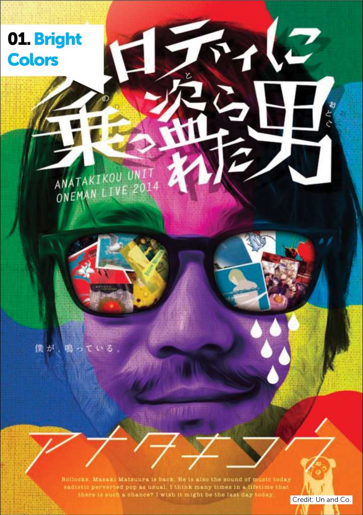
01. Bright Colors
One thing you will notice when delving into J-design is that it’s teeming with color and life. The more common color combination for Japanese design is red, gold, and black, but when searching through any archives you’ll see its full spectrum of palettes.
This use of color is rooted very heavily in Japanese culture in general. Take a look at the streets of Harajuku, or the vibrancy of Shibuya. It makes sense that this love for all hues would translate to graphic design.
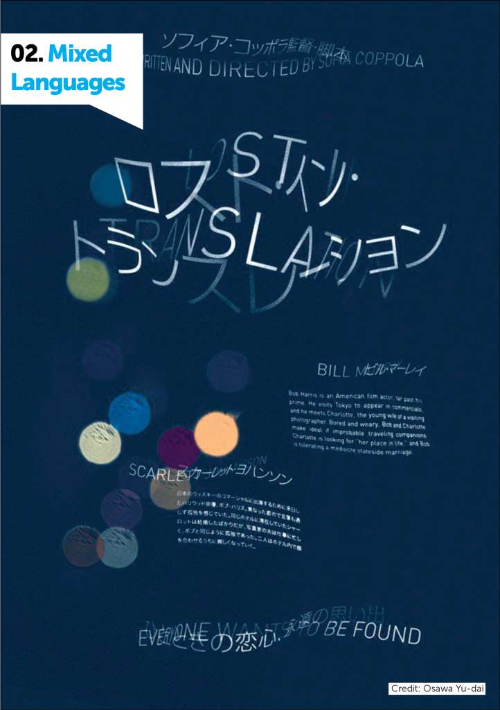
02. Mixed Languages
Another commonly recurring technique in Japanese design is the use of both Japanese and Roman characters in typography.
“Japanese words are usually written with ideographic characters, and can also be written with the Roman characters we’re familiar with, and English mixed with Japanese writing is also a common occurrence in Japanese design,” notes Ryan Hageman.
This stunning poster for the film Lost in Translation was created by Ryan Hageman, designer and curator of Gurafiku.
Using both Japanese and English, he transposed the lines of type over one another, manually curving the letterforms to make the two languages blend together.
The contrast between the two languages makes for an intriguing comparison of the two cultures and a highly engaging typographical design – particularly if you’re bilingual to both languages!
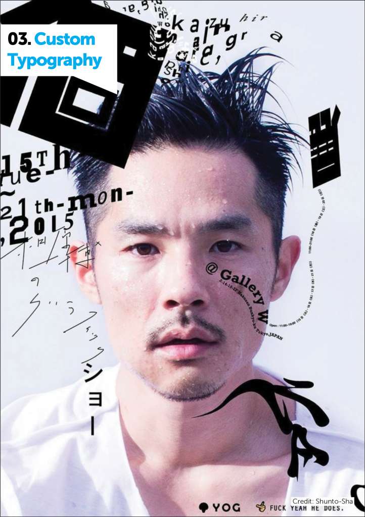
03. Custom Typography
Typography in Japanese graphic design culture is vastly different to western design culture for a number of reasons, but namely, the complexity of the Japanese character system.
Because of the fact that this type is often custom created for each project, it usually features quite heavily in designs.
This event poster by Shunto-Sha uses type as a focal graphic element to frame the image and draw attention to the written content. The custom lettering makes for a striking visual element, and one not easily replicated thanks to it’s unique and handcrafted nature.
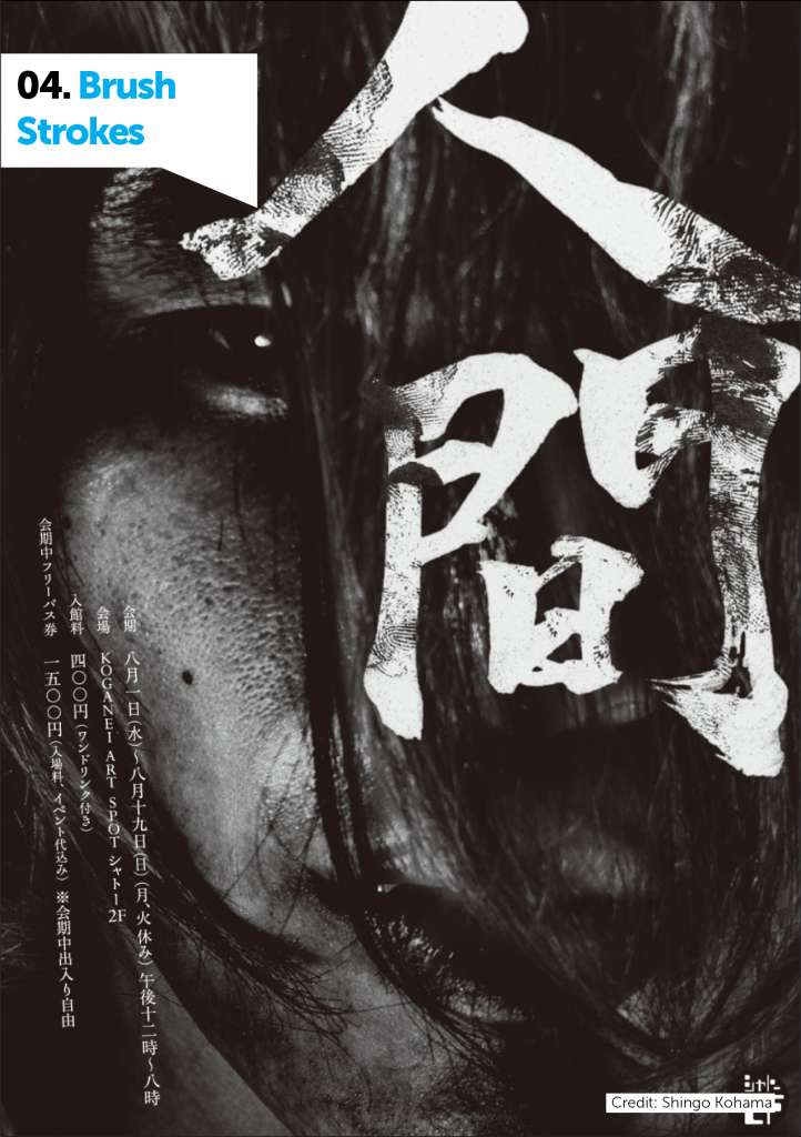
04. Brush Strokes
Brush strokes are yet another commonly recurring motif seen in Japanese design. This motif is largely in part tied to the traditional practises of Japanese calligraphy, also known as an art form called ‘Shodou’.
In Shodou art, the brush strokes are often messier, streaky, and cruder, as the art form dictates that no corrections to each stroke should be made, instead each line should simply flow into the next.
In this piece, Shingo Kohama uses brush strokes in a traditional way to create a stunning typographic treatment. By pairing the crude outlines of the painted lettering with roughened texture, you can unlock a truly stunning effect.
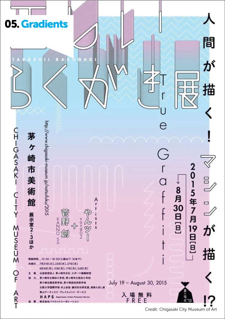
05. Gradients
Another trend you might observe in Japanese graphic design is a large use of gradients. Subtle colours fading and bleeding into one another is a very commonly used graphic element, often used for backgrounds to bring life and color to designs.
This piece for the Chigasaki City Museum of Art uses a beautiful and fresh gradient to bring life and color to the design. The transition from pastel blue to pink makes for a subtle but vibrant effect that pairs perfectly with the sharp black and white lettering.
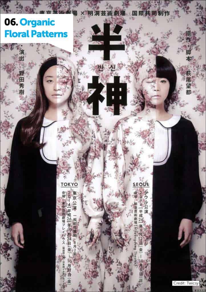
06. Organic Floral Patterns
Hanakotoba (or “Floriography”) is the study of flowers, an important facet of Japanese culture. In Japan, certain flowers and their colors are tied with certain ideas, symbols, and emotions. For example, pink flowers are thought to signify the curing of diseases, red is passionate love, and white symbolises virtue.
So, we see a lot of flowers and floral patterns being used in Japanese graphic design, both in a symbolic capacity as well as a decorative one. For example, this haunting poster via Twicsy uses pink and white floral imagery to create a jarringly beautiful effect.
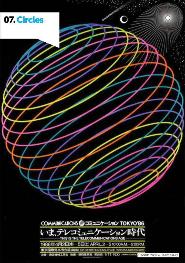
07. Circles
Just as the Japanese flag hints, circles are another recurring element in Japanese graphic design.
Inherent symbols of balance and harmony, circles are widely used motifs in Japanese design. A common motif used throughout Japanese culture is the Mon.
The Mon can be described as “the Japanese counterpart to the European coat of arms”. As Rain Noe writes, the Mon is “typically contained within a circle, tend to have axial or rotational symmetry, and rely more on abstract geometric shapes than realistic reproductions of real-world items.”
This valuing of symmetry and balance is evident in a lot of Japanese graphic design and is usually displayed via a heavy use of circle motifs. Check out this striking poster by Yusaku Kamekura that uses circles in a big, bold, and beautifully balanced way.

08. “Cute Culture”
I’m sure when I say ‘Japan’ you think of a lot of things, and chances are one of those things are the cute, exaggeratedly drawn cartoons we see so often associated with Japan.
This ‘cute culture’ (or “kawaii”) is a huge part of Japanese culture, the adorable animations are everywhere, from television shows and merchandise to professional branding ventures and products.
This poster for an exhibition by Yosuke Nakanishi / Yusuke Mashiba captures that sense of playfulness and ‘cute’ to a T.
The use of playful illustrations brings a unique touch of character, personality and life into the poster, a very different interpretation to the typical sleek, sophisticated event posters that dominate Western design.
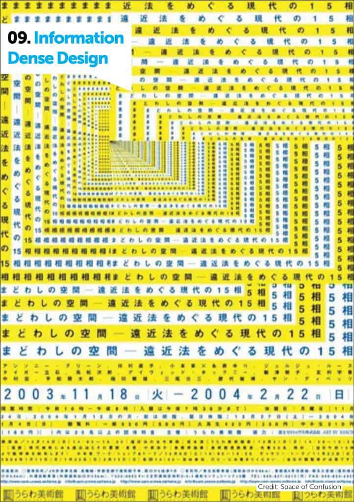
09. Information-Dense Design
When browsing Japanese designs, particularly when it comes to web design, you may begin to notice a trend in sites appearing very information-heavy and densely packed with type and content.
It would seem that minimalism does not have as large of a place in mainstream Japanese web design — but why?
In Japan, details are a welcome aspect of communication and therefore web design too, as a website conveys information and sells the company and its products in place of a live salesperson.
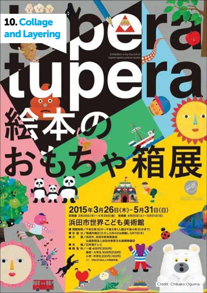
10. Collage and Layering
In a similar vein to the previous point, there is a large demonstrated propensity in Japanese visual design to layer elements, producing a collage-like effect.
This style, as can be seen in this piece by Chikako Oguma, is quite different to the typical clean lines and perpendicular shapes that typify more European design movements like the Swiss and Bauhaus.
Conclusion
It’s hard to break down Japanese design into just 10 categories of visual techniques. The culture of design in Japan is so ubiquitous, dynamic, and constantly evolving, but these 10 visual techniques are a good starting point for anyone looking to expand their design horizons.
If anything, we can take this lesson from Japanese graphic design: don’t be afraid to experiment. While (for the most part) western design dictates that when it comes to design aesthetics ‘clean is king’, don’t be afraid to shake that up.
Use color boldly, use traditional Japanese motifs, customise your type, get symbolic, seek balance, collage your elements in a way that most minimal designers would never dare.
If your interest in Japanese graphic design has been piqued by this collection of pieces, a fantastic resource to continue your research is Gurafiku. Compiled by designer Ryan Hageman, Gurafiku is a catalogue of the inspiring, engaging and wonderful parts of Japanese design.
Another fantastic resource is Japanese Design which compiles the latest art, design and creations from talented Japanese creatives.
Now over to you. What are your thoughts and feelings about the visual trends and techniques from Japanese designers? Have you noticed any other recurring techniques, or maybe there’s one that catches your eye in particular?