Every creative has faced them — the dreaded design red flags that can derail a project before it even begins.
Some are subtle. Others scream trouble from the first email.
Spotting red flags early can save you time, energy, and frustration — and protect the quality of your creative work.
Here are 8 common design red flags I’ve come across — and why you should never ignore them.
1. “I just need it to look nice.”
This might sound harmless, but it’s one of the most common design red flags.
When a client can’t explain what “nice” means — or what success looks like — you’re left designing without direction. Design is more than decoration; it should be strategic, purposeful, and goal-focused.
Without a brief or objective, you’re just guessing.
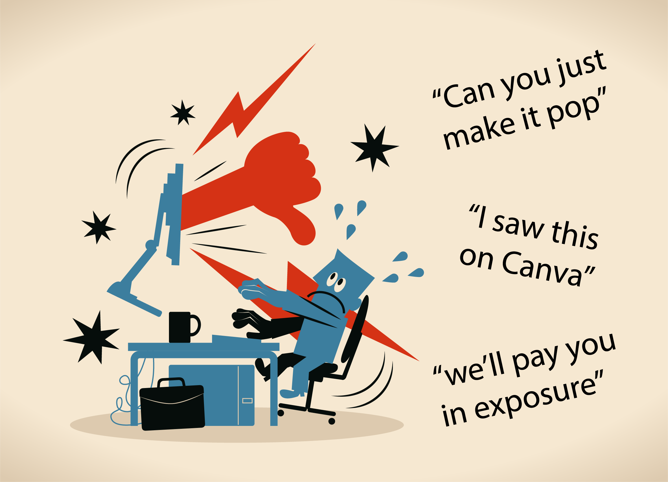
2. No budget (or “we’ll pay you in exposure”)
This is one of the most obvious red flags in design projects.
Exposure doesn’t pay your bills.
Clients who avoid talking about budget, or undervalue your services, often don’t respect your time either. They’re more likely to micromanage, overstep boundaries, or expect free extras.
3. “Can you just make it pop?”
A classic vague request — and a massive red flag.
“Make it pop” usually means “I don’t know what’s wrong, but I don’t like it.” This kind of feedback leads to endless revisions because there’s no clear direction.
Clear feedback comes from a clear brief. If that’s missing, prepare to be stuck in an endless loop.
4. Too many decision-makers
One of the trickiest design red flags: everyone has an opinion.
When feedback comes from the intern, the CEO’s partner, and a friend who “knows Photoshop,” you’re in trouble. Design by committee leads to diluted ideas and unfocused work.
👉 See how to manage stakeholder feedback better:
5. No deadlines / rush jobs
Lack of structure is a hidden design red flag. It usually means:
-
No clear timeline → the project drags forever
-
OR total panic → “Can we have this by the end of the day?”
Both scenarios signal poor planning or lack of commitment.
Great design takes time, clarity, and space to think.
6. No content, no assets, no brief
“We’ll send the copy later.”
(Spoiler: they rarely do.)
This is one of the more frustrating design red flags.
You can’t create strong, strategic design without content. Designing with placeholders often leads to mismatched visuals once the real content appears.
👉 Check out this UX tip on content-first design:
7. Asking for too many options upfront
“Can we see five different versions to choose from?”
This request often hides indecision and a lack of direction — a subtle but serious design red flag.
It leads to “pick and mix” feedback where the client wants to combine elements from every version. It’s a fast track to scope creep and creative burnout.
Instead, collaborative planning and focused concepting always wins.
8. “I saw this on Canva…”
This one’s increasingly common — and one of the newer red flags in design.
Clients who’ve used DIY tools like Canva often don’t understand the value of custom, strategic design. They may expect low prices but high-end results — a mismatch that rarely ends well.
👉 Read more: Why Professional Design Goes Beyond Templates
Conclusion: Don’t ignore the design red flags.
Trust your gut. If something feels off at the start of a project, it probably is.
Spotting design red flags doesn’t mean you have to walk away — but it does mean you need to protect your process. Set boundaries. Ask questions. Align expectations early.
At Coco Loco Studio, I believe design should be bold, strategic, and collaborative — never chaotic.
Seen any of these design red flags lately?
Let’s talk before they derail your next project.